Interior Styles, Specified: Japandi, Minimalism and Biophilic in Boards and Finishes
We are an execution contractor, so we do not forecast taste and we are not going to tell you what is in this year. What we can tell you is something more useful: what each of these style names actually specifies once it reaches a Bill of Quantities, and which of them are unforgiving to build. A style is a set of material and tolerance decisions. Name it however you like; it gets built as a board, a finish, an edge and a handle.
Why this page has no trend forecast in it
Almost every article answering "what are the interior trends this year" is written to sell something, and none of it survives contact with a fit-out. We take a narrower position: joinery is semi-permanent, so what matters is not whether a look is current but whether it will still be tolerable when it is eight years old and cannot be cheaply changed.
That produces one principle that runs through everything below. Put permanence in the things that are hard to change and fashion in the things that are easy. Carcass, shutter finish, worktop and hardware are a decade-long commitment — the carcass carries a ten-year warranty for a reason. Paint, textiles, loose furniture, cushions and light fittings are a weekend. A style executed by making the joinery fashionable is the expensive way round.
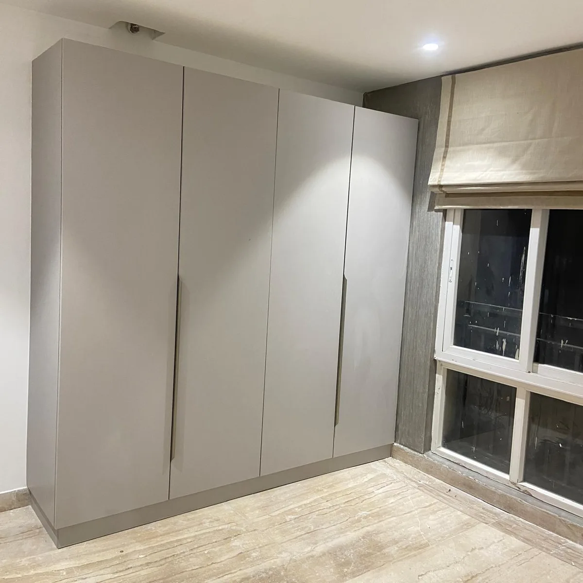
Japandi
Japandi is the most requested and least defined of these names — a Japanese-Scandinavian hybrid, in practice meaning warm neutrals, visible grain, low visual noise and no shine.
What it specifies: a matte finish, almost always. Matte laminate or a natural veneer rather than acrylic or high-gloss PU, because gloss is the one thing that breaks the look immediately. Warm-neutral tones — oat, putty, pale oak — over both cool greys and orange-toned wood. Grain running consistently in one direction across a run, which is a real specification and not a detail you can add later. And handle-less shutters, usually a J-profile or G-profile channel, or slim recessed pulls.
What it costs you in execution: grain matching. Once you ask for continuous grain across a wardrobe run or a kitchen line, the sheets must be selected and cut as a set, offcuts stop being interchangeable, and wastage rises. That is a genuine cost and a legitimate one — but it should be a named line in the quotation, not a surprise.
Warm minimalism
Minimalism's correction. Where strict minimalism went white, cold and hard, warm minimalism keeps the discipline — few visible objects, unbroken planes, concealed storage — while replacing the palette with warm neutrals and the flatness with texture.
What it specifies: texture doing the work colour used to. Suede and textured laminates, fluted and grooved panels, matte finishes with a tactile surface, and tone-on-tone rather than contrast. Concealed hardware throughout — push-to-open or channel pulls, since a visible handle row is the thing that reads as clutter. Storage volume goes up, not down: a room with nothing on show needs somewhere for all of it to be.
What it costs you: more storage than the room appears to contain, and the tolerance problem below.
Minimalism proper, and whether it is still worth doing
Minimalism is not out of favour; it is simply the most expensive of these styles to execute well, and that is why so much of it looks wrong.
A flat slab shutter with no routing, no handle and no grain has nowhere to hide anything. Every substrate imperfection telegraphs through, which is why gloss and flat-slab work needs HDHMR or MDF as a substrate rather than plywood — the grain-free flatness is the entire point. Handle-less shutters must align across a run within a millimetre or two, because with no handle to draw the eye the shadow gap is the design, and an uneven gap is the only thing anyone will see. Push-to-open mechanisms have to be good, since a mechanism failure on a handle-less door leaves it with no way to open it at all.
So the honest answer to "is minimalism still popular" is that it never stopped being popular and it is routinely under-budgeted. Minimalism removes every device a fit-out normally uses to absorb tolerance. If the budget cannot carry precise alignment and a good substrate, a textured or grained finish will look far better than a badly executed flat one.
Biophilic design
The most abused of these terms — usually reduced to putting plants in a render. As a specification it is mostly about light, air and maintainable planting rather than about greenery as decoration.
What it specifies, in an apartment: daylight prioritised in the layout, meaning storage kept off the window wall and glazing not blocked by a tall unit. Lighting circuits that follow daylight rather than fight it, so evening light is layered and warm instead of a single bright ceiling load. Natural materials with visible grain — veneer, cane inserts, stone — over printed imitations of them. And planting that is actually detailed: a planter with drainage and a waterproof tray, integrated into joinery, positioned where the light genuinely is.
What it costs you: the planting detail is where this fails. A planter built into a carcass without waterproofing and drainage is a wet-zone unit that nobody specified as one, and it will destroy the board under it. If planting is integrated into joinery it must be BWP to IS 710 with a sealed metal or moulded tray, treated exactly like a sink cabinet. This is the single most common way a biophilic reference turns into a repair.
Colour: the one question we will not answer the way you asked it
We publish no colour forecast and will not, because a colour chosen for a season gets locked into joinery for a decade and there is nothing we could tell you that would still be true when it mattered.
What we will say is where colour belongs. Put it in paint, textiles, art and loose furniture, all of which are cheap and reversible. Keep the joinery — the carcass, the large shutter runs, the worktop — in something you would still accept as a neutral background in eight years, and let the room's character come from the layer that can change. The specific trap: a strongly coloured laminate discontinued in three years cannot be matched for a repair or an extension, so a single damaged shutter becomes a whole run.
If you want a durable rule instead of a forecast: choose the joinery tone against the flooring and the natural light the flat actually gets, not against a photograph taken in a different country's daylight.
Mixing modern and traditional without the rooms fighting
Our page on common design mistakes warns against rooms that do not relate to each other, which reads as an argument against mixing. It is not. It is an argument against mixing without a rule, and the distinction is worth drawing properly because combining a contemporary flat with traditional pieces is the normal Indian requirement, not an exotic one.
Three disciplines make it work:
- Let one register be the base and the other the guest. A predominantly contemporary flat holding three or four strong traditional pieces reads as considered. A fifty-fifty split reads as unresolved. Decide which one is the background before anything is ordered.
- Keep the shell consistent and vary the contents. Flooring, ceiling treatment, door and window language and joinery finish should run continuously through the home. Traditional character then arrives through furniture, textiles, art, brass and the pooja space — the layer that is meant to differ. Rooms feel mismatched when the shell changes, not when the objects do.
- Give the traditional element the whole wall. A carved piece, a swing or a temple unit needs quiet around it. Placed in a busy run it looks like it was left over; given its own plane with restraint on either side, it looks intentional.
The exception is the pooja space, which is legitimately allowed to be traditional on its own terms even in an otherwise contemporary flat — nobody reads that as inconsistency. We cover its detailing separately in pooja room interiors.
So which style suits Indian homes?
The ones that tolerate our conditions. Three constraints decide more than taste does: cooking that puts oil in the air, several months of high humidity, and dust. Those favour matte over gloss, textured over mirror-finish, mid-tones over both white and very dark, and handles you can actually clean. Two of the styles above are already aligned with all of that, which is a large part of why they read as current here.
The styles that fight the conditions are not off-limits, they are just conditional: high-gloss acrylic is achievable and needs a household that will maintain it, as acrylic versus laminate sets out. Pick the style you want, then specify against the climate rather than against the photograph.
Written by AlcorOne Solutions
AlcorOne Solutions is an interior contracting firm working across Chennai, Hyderabad, Bengaluru, Vizag and Rajamahendravaram. This guide was compiled by the project team from itemised BOQs, vendor quotations, and site records from our own fit-outs, and is reviewed by the partners before publication.
Sources & references.
Standards, regulatory registries, and manufacturer references that back the material grades, pricing framework, and compliance points in this guide:
Frequently asked questions.
What is Japandi?
A Japanese-Scandinavian hybrid, and in specification terms it means matte finishes, warm neutrals, visible consistent grain and no visible handles. Built, that is matte laminate or natural veneer rather than acrylic or gloss PU; oat, putty or pale-oak tones rather than cool grey or orange-toned wood; grain running the same direction across a whole run; and handle-less shutters using a J-profile or G-profile channel or slim recessed pulls. The cost consequence to ask about is grain matching — continuous grain across a run means sheets are selected and cut as a set, offcuts are no longer interchangeable, and wastage rises. It should be a named line in the quotation.
What is warm minimalism?
Minimalism with the coldness removed — the same discipline of unbroken planes, few visible objects and concealed storage, but with warm neutrals instead of white and texture instead of flatness. It specifies suede and textured laminates, fluted or grooved panels, tone-on-tone rather than contrast, and concealed hardware such as push-to-open or channel pulls throughout. The practical catch is that a room with nothing on display needs more storage than it appears to contain, not less.
What is biophilic design, and does it work in an apartment?
It works, but it is about light, air and maintainable planting rather than plants as decoration. In a flat it means keeping storage off the window wall so daylight is not blocked, lighting circuits that layer warm evening light instead of one bright ceiling load, real grained materials over printed imitations, and planting that is properly detailed. That last point is where it usually fails: a planter built into joinery without drainage and a waterproof tray is an unplanned wet zone that will destroy the board beneath it. Integrated planting needs BWP IS 710 and a sealed tray, treated exactly like a sink cabinet.
Is minimalism still popular?
It never stopped, and it is the most under-budgeted style we are asked for. Minimalism removes every device a fit-out normally uses to hide tolerance — a flat slab with no routing, grain or handle telegraphs every substrate defect, which is why gloss and flat-slab shutters need HDHMR or MDF as a substrate rather than plywood. Handle-less runs must align within a millimetre or two, because the shadow gap becomes the design and an uneven one is all anyone notices. If the budget cannot carry precise alignment and a good substrate, a textured or grained finish will look considerably better than a poorly executed flat one.
What are the colour trends for interiors?
We do not publish one. A colour chosen for a season gets locked into joinery for a decade, and no forecast we could give would still be useful by the time it mattered. The durable rule is to put colour where it is reversible — paint, textiles, art, loose furniture — and keep the joinery, worktop and large shutter runs in a tone you would still accept as a background in eight years. There is also a specific repair trap: a strongly coloured laminate discontinued in three years cannot be matched, so one damaged shutter becomes a whole run. Choose joinery tone against your actual flooring and daylight rather than against a photograph shot in another country's light.
Can I mix modern and traditional in the same home?
Yes, and it is the normal Indian requirement rather than an unusual one. Three rules keep it from looking unresolved. Make one register the base and the other the guest — a contemporary flat holding three or four strong traditional pieces reads as considered, while a fifty-fifty split does not. Keep the shell consistent: flooring, ceiling, door language and joinery finish should run continuously, with traditional character arriving through furniture, textiles, brass and art. Rooms feel mismatched when the shell changes, not when the objects do. And give a strong traditional piece its own wall with quiet either side. The pooja space is the accepted exception and can be traditional on its own terms.
Which interior style suits Indian homes best?
The ones that tolerate the conditions: cooking oil in the air, months of humidity, and dust. That favours matte over gloss, texture over mirror finish, mid-tones over white and very dark, and handles that can be cleaned — which is a large part of why Japandi and warm minimalism read as current here. Styles that fight those conditions are not excluded, only conditional: high-gloss acrylic is entirely achievable if the household will maintain it. Choose the look you want, then specify it against the climate rather than against the photograph.
Send the references you have collected. What you will get back is not a critique of your taste but a specification — which board, which finish, which edge, which handle, and which of those references are expensive to build rather than expensive to buy. That distinction is usually the whole budget conversation.
Send the mood board. We will send back the BOQ.
The useful conversation about style is which board, which finish, which edge and which handle — and which of your references are expensive to build rather than expensive to buy.
Get a callback + itemised BOQ
Leave your name and number — we'll call you back with a scope and a ballpark BOQ for your Hyderabad project. No obligation.